ioLight by Lumenus
Designing a responsive e-commerce site to help make urban mobility safer.
Overview
Lumenus is a brand that makes wearable technology easy for bicyclist and other urban commuters. The ioLight is their latest and hero product. It’s a smart bike light with GPS navigated turn signals and a mobile app, all designed to increase the safety and visibility of cyclists on the road.
In this project, our team look to redesign their existing site and reduces friction from the landing page to checkout.
My Role Visual Design Lead / Interaction Design / UX Research
Tools Figma / Photoshop / Miro / Optimal Sort / Otter.ai
Team 3 UX Designers / Photographer / Developer
Duration May 2020 - June 2020

Project Scope
Users need a reliable and efficient way to purchase their bike light from Lumenus because currently there isn't an e-commerce website to make the purchase.
Solution
We believe that by designing a responsive e-commerce website that is easy to navigate and helps users understand how the product works, users will be more inclined to complete their purchase.
Challenges
Design an easy to navigate eCommerce website
Established a brand identity and design system
Write/Create content that tells the story of the product (mobile app + smart light)

Understanding Our Users
Discovering: Industry Trends, C&C Analysis and User Interviews + Surveys
Interviews
We started off doing user interviews as a way to get to know our users and their lifestyle, personality, and needs. These interviews gave us information on the type of jobs they typically have and how they knew cycling was an efficient means of transportation for them. We were able to find out their main concerns, their pain points as bicyclists and what they are looking for when buying bike accessories, and how much they were willing to spend on something referred to as a “smart bike light”.
Surveys
Although the interviews gave us great info on users' personality, it didn’t give us anything on their actual shopping habits, which is critical for designing an e-commerce site. We decided to create a survey that will inquire about which websites users are shopping on the most, so that way we get an idea of what kind of checkout flow we can study for our designs. It also helps us understand how we want information on the site to be displayed.

Key Insights from Our Users
Shopping Habits
This served to be a very important finding in our research as we originally intended to focus our design efforts towards a desktop experience. With the understanding that our users are always on the move, we wanted to ensure users they had same experience on their mobile devices, if not better.
Target Users
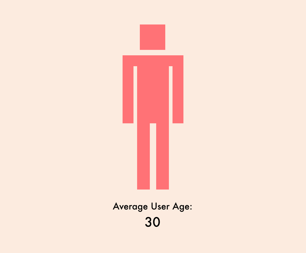
On average, users rode their bikes 4x per week. They all expressed how important it is to be visible on the road during low light hours.
Our users have a busy mobile centric lifestyle and being efficient and safe is their main concern.
Payment Habits
Only 27.8% of our users preferred to manually input their card information while shopping. Our user shared that using paypal, apple pay or other auto-fill methods are more convenient and aligned with their busy lifestyle.

Personas & Journey Maps
To focus on the website’s ideal users, we created a primary and secondary persona as well as journey maps.
The Personas are a great way to have that target user present at every step of the design process across teams and multiple collaborative initiatives.
The journey map served to be a very helpful artifact as it illustrated our persona’s processes, needs, and emotional state across their interactions before, during, and after visiting the website.
Casey’s Retrospective Journey Map

Design studio & Wireframe Iterations
Design Phase
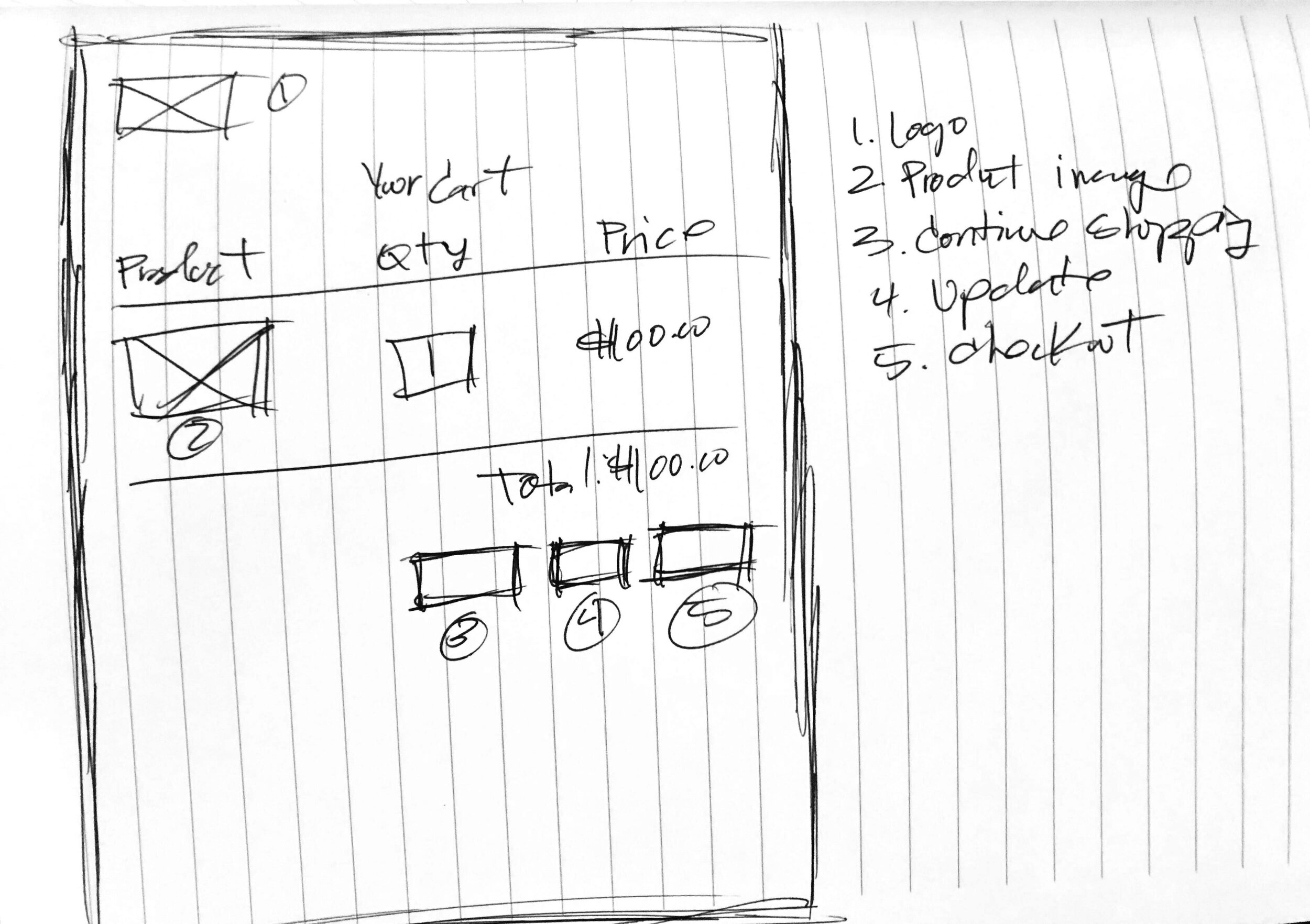
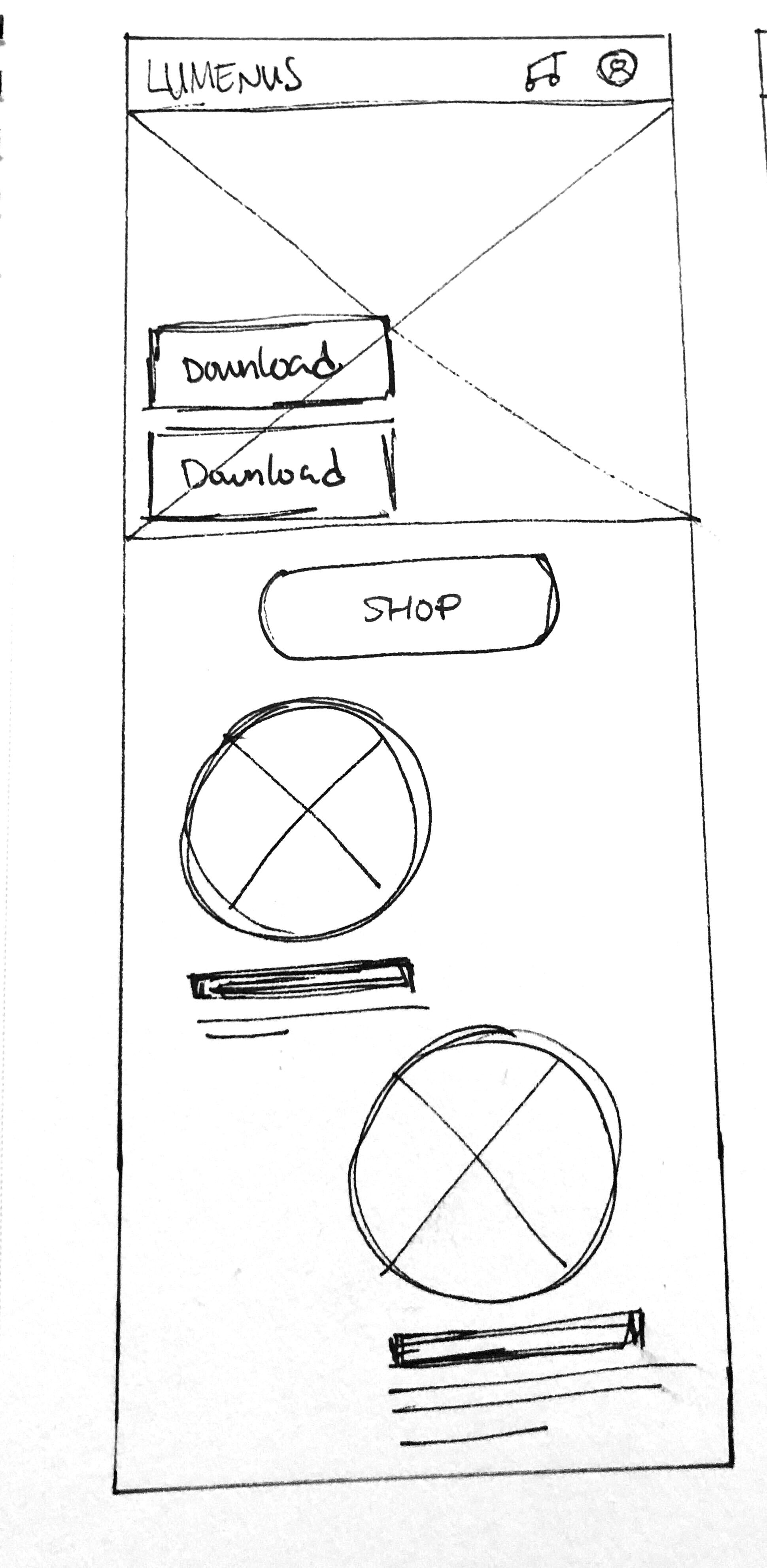
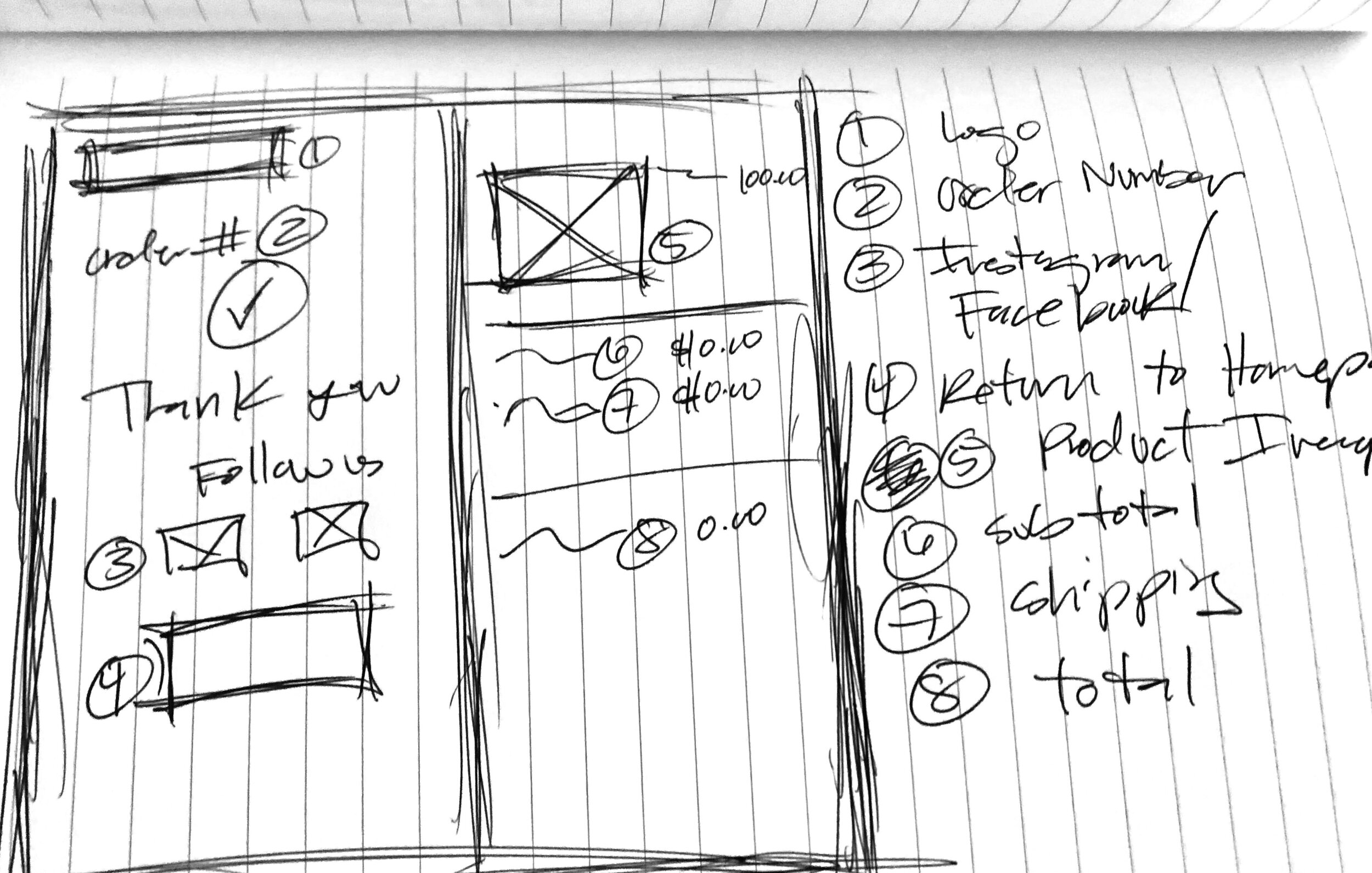
knowing that 44% of our user group utilized mobile platforms to shop we launched the design phase. We conducted a design studio sketching exercise, which we called 2 for 2 (2 platforms for 2 days). We wanted to ensure the designs were consistent and provided the same experience on both interfaces.
Content Prioritization
Creating content that tells the story of the product (mobile app + smart light) was one of our main challenges and we had to made sure our users grasp the narrative in a quick amount of time with the use of the right imagery and copy.
Hand sketches


Mid-Fi Wireframes
Testing Our Prototype
Clear Signifiers
Users were not aware of the content below the fold therefore we added an arrow. Later on we discovered that users were clicking on the arrow expecting it to expand. We then add “scroll” above the arrow which aid to the allowance to scroll down and see all the narrative of the homepage.
Fixed Button
Prior to our usability tests we had the Shop Now CTA on the top navigation bar. We discovered that users did not want to scroll of the way to the top to click the button therefore we had the CTA be fixed to the bottom right of the screen. By doing so we cut the checkout process time by more than half in our second round of usability test.
Fewer Steps
The experience of our users was very important to us, we listened to their feedback and reduced the number of screens of the checkout process.


