Overview
Rescue Alert is a family-owned company that develops life alert devices and monitoring services. Current products include a base unit, push-button pendant with fall detection, and GPS-enabled push-button pendants for “on the go” protection.
We were challenge to create a digital solution that would connect caregivers to the life alert devices by providing visibility of all the medical information and alerts/activities from the patients.
Roles: UX Research Lead and Visual Designer
Team: Justin Lee, Jose Veliz, Noel Harris
Tools: Figma, Sketch, Adobe Illustrator, Adobe Photoshop, Mural, Pen/Paper
Duration: 2.5 weeks
Problem
Caregivers need a way to receive alerts and live information in a timely manner because they need to tend to emergencies promptly and stay well-informed.
Goals
Equip caregivers with an effective tool that would increase their efficiency and reduce their stress
Bring innovation and business value into the life alert system industry
Increase the caregiving awareness in the industry

Qualitative and Quantitative Research
At the kick-off of this project, we didn’t have a clear idea or direction we were taking. As the research lead, I started by doing some field research as well as some competitive & comparative analysis. I was able to gather data that I later used to formulate user survey and user interview questions which resulted in discovering these 3 main insights from our participants.
Multiple Device Tracking
During our user research, we learned that patients (elderly folks) pressed their life alert button by accident. This results in unnecessary property damage as EMT have to get in their homes promptly.
We believe that having multiple device tracking will reduce the confusion on the condition and location of the patient in those dark moments.
Care Community
Participants in our user research expressed they often don’t know how to help their loved ones in specific situations.
Creating a network of caregivers for them to post and answer each other’s questions would be of great use to them, in addition to incorporating a search for articles and videos as additional resources.
Care Circle
This was a big aha moment for us. Until now we thought the problem was the visibility of alerts. However, by emphasizing with the end user we discovered this pivotal need for caregivers.
Having this in mind we created a new feature called Care Circle. Providing a contact list for each patient in an accessible manner gives the caregiver a sense of team effort and community.

Affinity Mapping, Personas and Feature Prioritization
Synthesizing all the feedback we got from our user interview and survey allowed us to create a persona. We wrote HMW questions and had a productive design studio which led to feature prioritization.
Having a better understanding of user pain points and needs of Shelly, we were able to redefine the problem:
How might we alleviate the stress placed on Shelly as a caregiver?

Sketches, Wireframes, Iterations
This being a brand new solution we decided to start mobile first as it is best practice. We began our ideation by sketching low-fidelity wireframes that incorporated our research findings and continue iterating to Hi-fidelity with each round of usability testing.
Lo-Fidelity Wireframes
Sketching with pen and paper was a great start to our ideation. We had an internal usability test to figure out the best way to move forward to mid-fi.
Mid-Fidelity Wireframes
At each step we tried our best to empathize with our user. What would be more beneficial to a caregiver to have in the homepage? We asked ourselves questions to stay in the same page and always align to the user needs.
Insights from Usability Testings
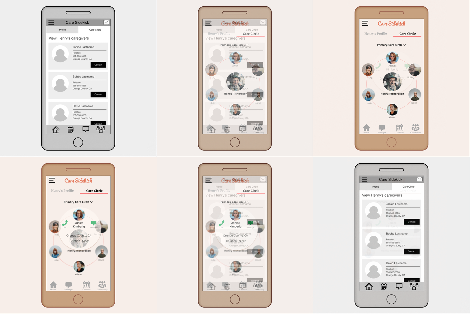
The New Care Circle
Participants were not sure as to what this feature was, they were confused since it was the same layout as the patients page.
We re-designed this page to be more engaging and more clear to the user. We included a call and message option that was requested on our usability tests.
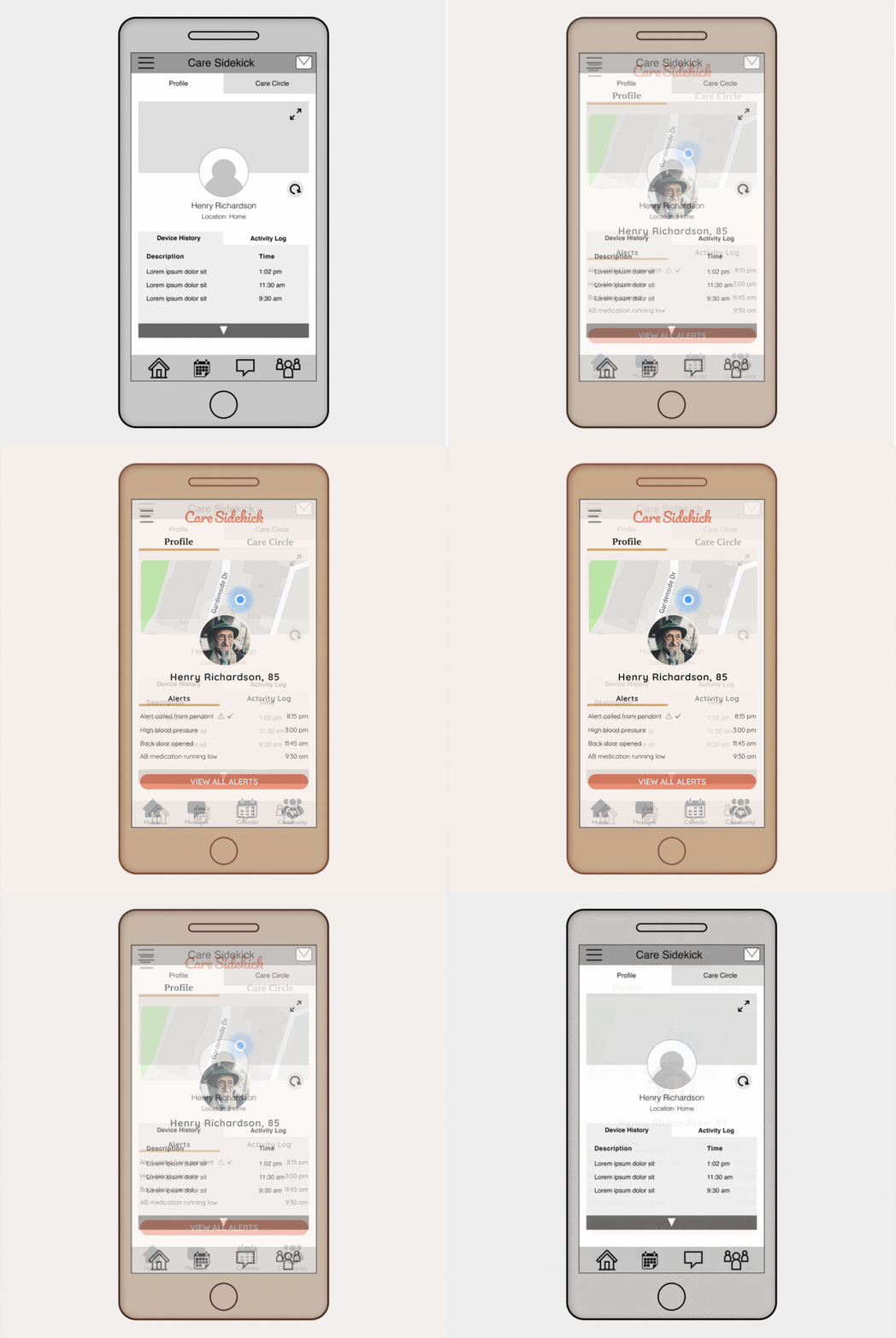
Live Alerts
We replace Device history with Alerts since most of our participants agreed to be the most important thing to see.
A number of participants also were confused on the ‘refreshed” button since they would expect the alerts to be live and to refresh themselves.
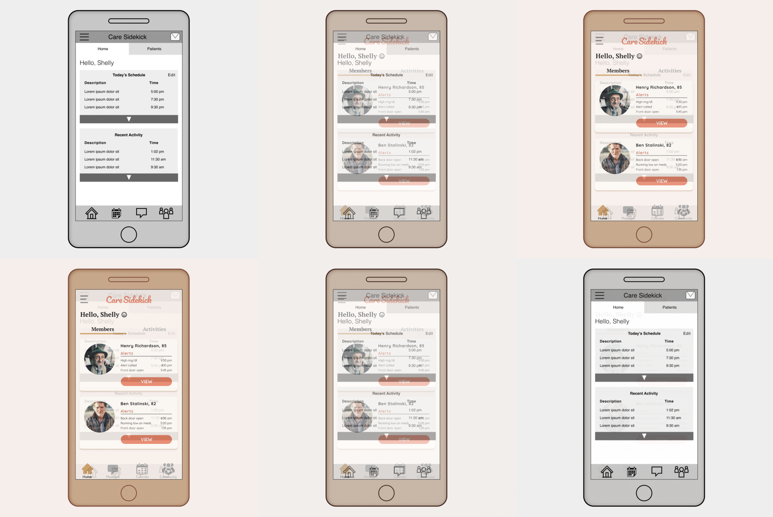
The New Home Page
Most of our participants wanted to see the patients list right away in the home page instead of the activity.
Having the patients as the first thing you see also reduced the amount of clicks for the user.

High Fidelity Prototype
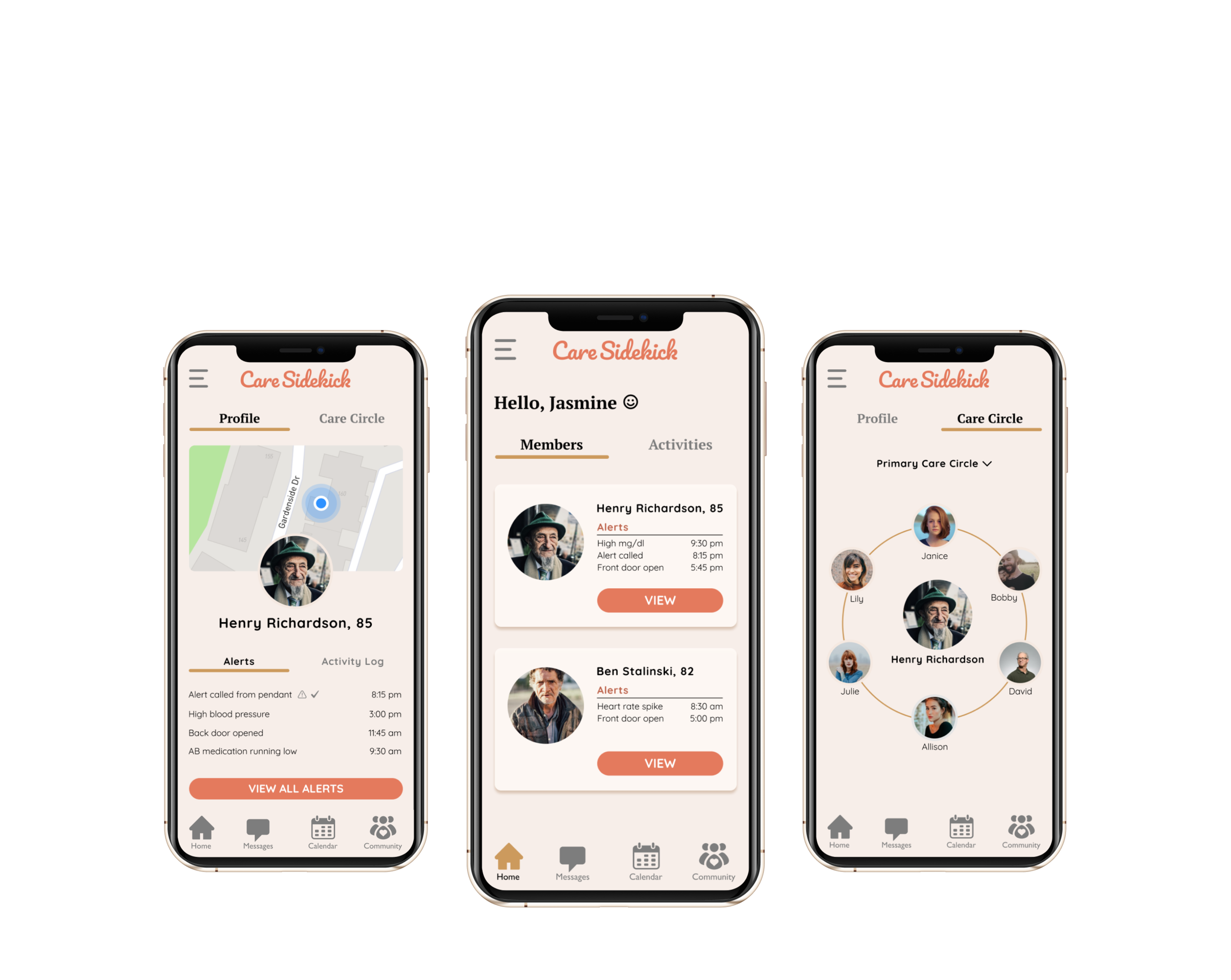
After another round of usability testing and much iterations we are proud and confident to deliver our digital solution that will facilitate the lives of caregivers and their patients.
Next Steps
As there is many moving parts and different user groups (EMTs, response center, etc) we would like to do contextual inquiry with our product to fully understand the needs and problems of the user.
We would like to fully flesh out the Care Community Page to provide our user with a way to look up resources and to connect with other care givers in her area and/or globally.


